Designing a music institute website requires more than just adding beautiful images and text. It involves building a digital environment where students feel inspired, confident, and motivated to enroll. The visual layouts shared above from the Artistry – Indian Music Website demonstrate how a thoughtful music academy website design can combine creativity, usability, and a conversion-focused structure.
This design concept, created by Devoq Design, reflects how a modern music academy website design can support both offline institutes and online music class website design requirements. Let’s explore each section of the design and understand how these elements can guide your own website planning.
Why Your Music Institute Website Matters More Than Ever
A music website is often the first interaction potential students have with your brand. Visitors evaluate:
- Your teaching credibility
- Course quality
- Professionalism
- Trustworthiness
- Ease of enrollment
An outdated or confusing interface can instantly lose a potential lead.
Modern learners expect:
✔ Clean navigation
✔ Mobile responsiveness
✔ Fast loading speed
✔ Clear call-to-actions
✔ Emotional storytelling through visuals
This is where modern music academy website design becomes critical.
Design Inspiration: Creative Music Institute Website Design
The Artistry website UI designed by Devoq Design demonstrates how thoughtful design can elevate a music brand without overwhelming users. The layouts focus on:
- Balanced color palettes
- Large hero visuals
- Elegant typography
- Structured sections
- Clear hierarchy
This approach reflects a creative music institute website design philosophy, blending artistic emotion with functional clarity.
Homepage Hero Experience (First Impression Matters)
The homepage hero section immediately communicates the soul of the brand. A large vocalist image, bold headline (“Immerse Yourself in the Melodies of Indian Classical Music”), and two clear call-to-action buttons (“Join a Class Today” and “Explore Our Courses”) establish clarity within seconds.
This layout highlights the importance of emotional storytelling in creative music institute website design. Music is an emotional art form, and showing a passionate performer creates instant trust and connection with visitors.
From a usability perspective:
- The navigation bar is minimal and readable.
- Buttons are visually prominent for quick decision-making.
- The contrast between background and typography improves accessibility.
This structure works exceptionally well for online music class website design, where users need instant clarity about what the platform offers.
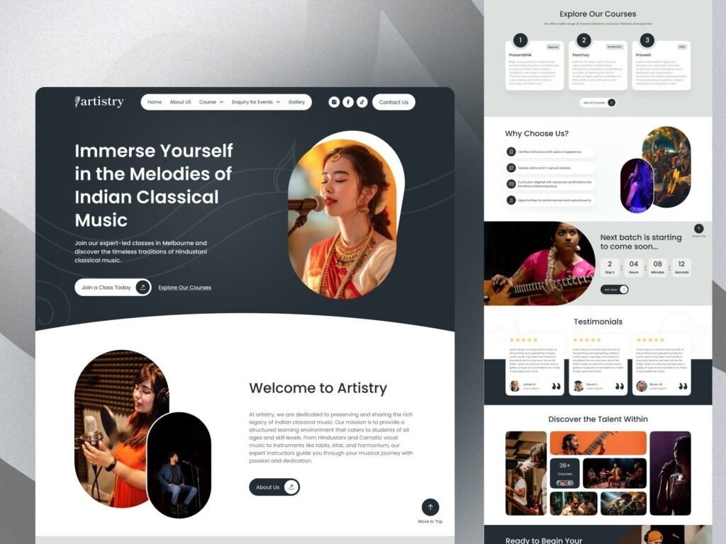
Course Exploration Layout (Structured Learning Path)
The course exploration section displays multiple learning levels, such as beginner, intermediate, and advanced programs, using well-aligned cards. Each course block is visually separated, making it easy for users to scan and compare options.
This layout supports:
- Faster browsing experience
- Reduced cognitive load
- Clear content hierarchy
A well-organized course section is essential in music academy website design because users often arrive with specific learning goals. By visually grouping the programs, the website improves user satisfaction and engagement.
This type of structure also works perfectly for institutes offering hybrid learning models, strengthening the platform’s role in online music class website design.
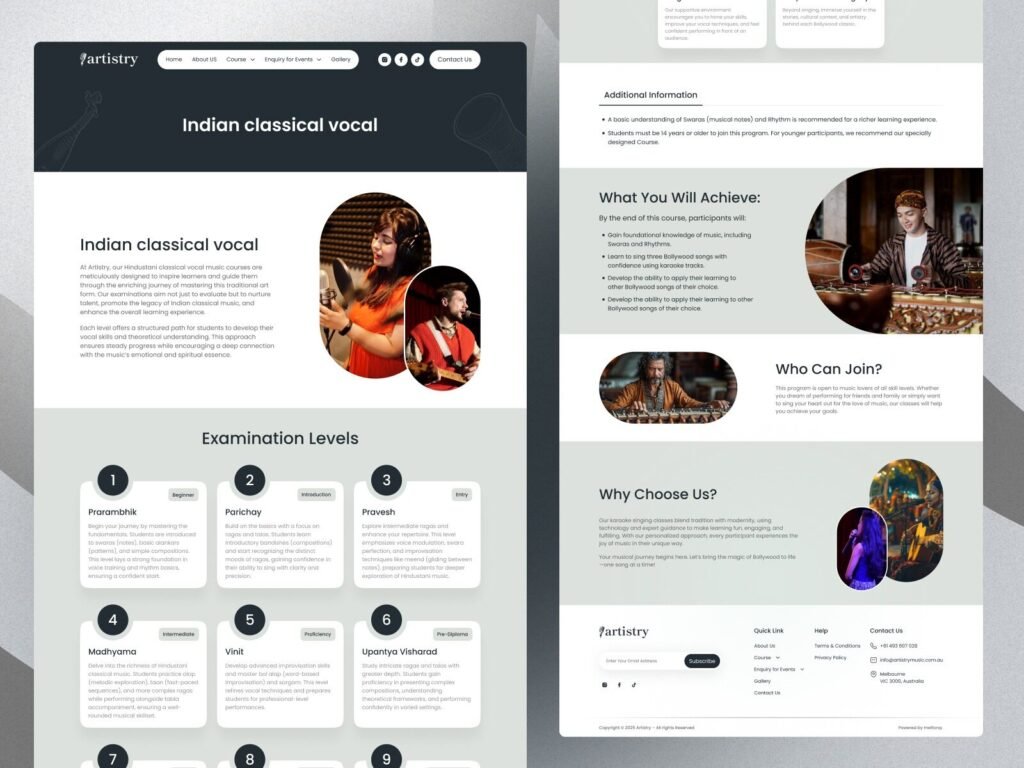
Why Choose Us Section (Trust & Credibility)
The “Why Choose Us” section uses icons, short bullet points, and supporting imagery to communicate credibility. Elements such as instructor expertise, flexible classes, certifications, and performance opportunities are visually highlighted.
This is a critical trust-building zone in any custom website design for music academies. New visitors often need reassurance before committing to enrollment or inquiries.
The layout uses:
- Iconography for quick scanning
- Short readable content blocks
- Balanced spacing for clarity
These micro-design choices significantly improve conversion potential.
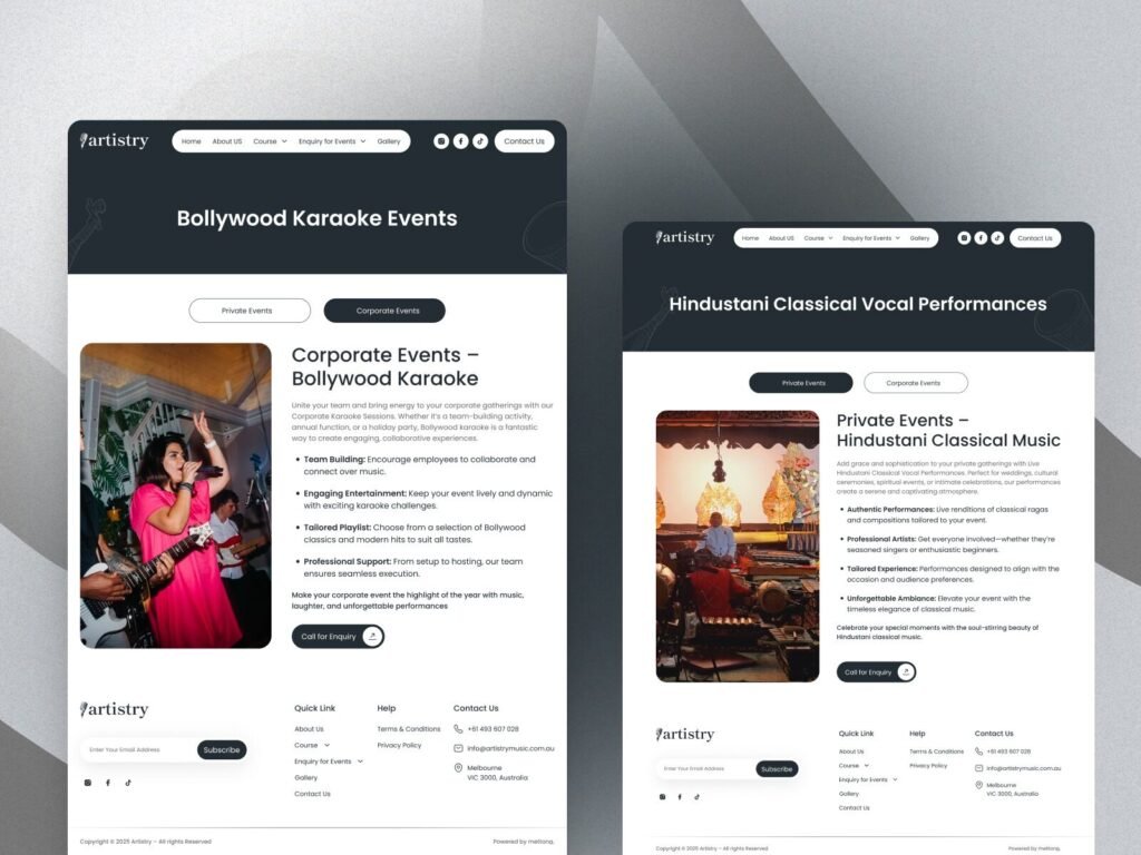
Event Pages & Mobile UI Design (Responsive Experience) (Engagement & Monetization)
Event Pages
The event layouts such as “Bollywood Karaoke Events” and “Hindustani Classical Vocal Performances” demonstrate how a music institute can diversify offerings beyond regular classes.
The design includes:
- Large event visuals
- Clear event category toggles (Private / Corporate)
- Strong CTA buttons
This structure encourages event inquiries and bookings, making it valuable for institutes looking to expand revenue streams. It also highlights how modern music academy website design supports business scalability.
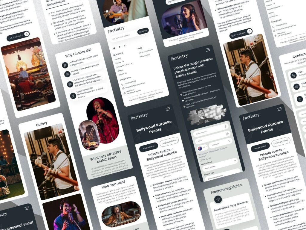
Mobile UI Design
Mobile screen previews demonstrate that every section adapts smoothly across devices. Buttons remain thumb-friendly, text remains readable, and navigation remains simple.
Since most users discover educational services on mobile devices, responsive design directly impacts Google rankings and conversions especially for online music class website design.
Mobile optimization ensures:
- Faster load times
- Better SEO performance
- Higher engagement rates
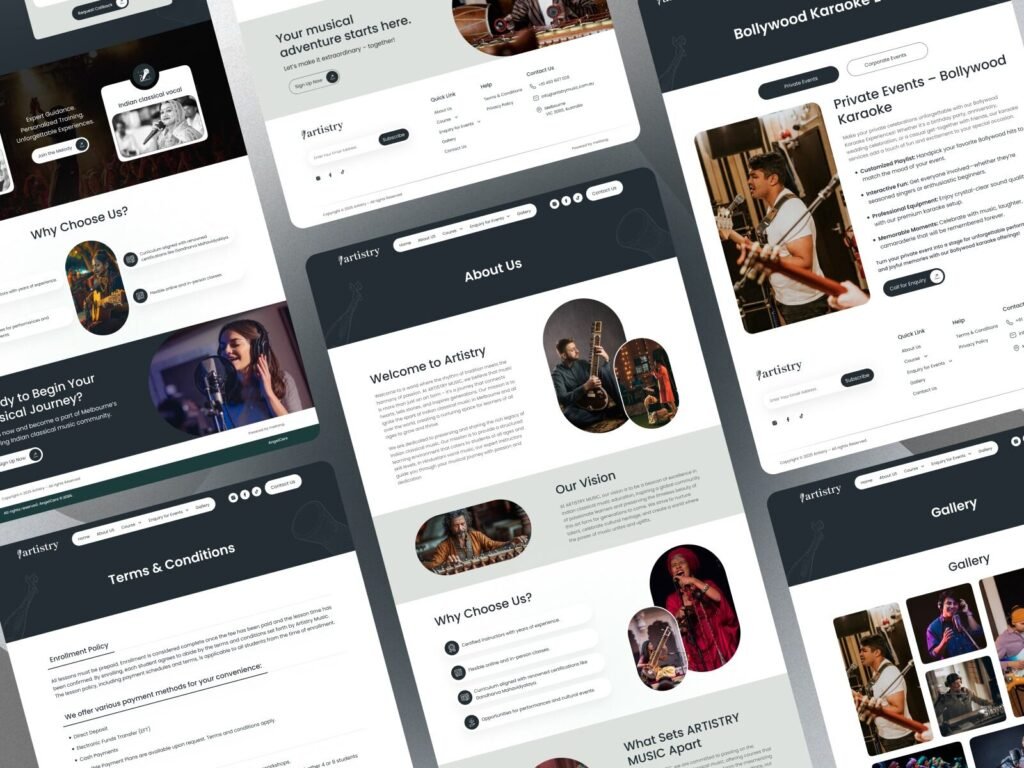
Indian Classical Course Page (Cultural Authenticity)
This section visually represents Indian classical music training using culturally rich imagery and calm color tones. The layout balances textual information with immersive visuals, preserving the authenticity of the art form.
This directly supports niche targeting for Indian classical music website design, allowing institutes to position themselves as authentic and professional.
The structured content layout ensures:
- Easy comprehension
- Emotional storytelling
- Cultural credibility
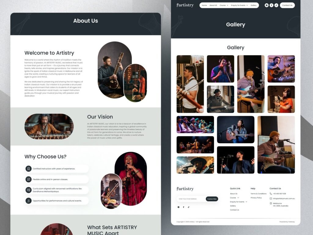
About Us & Gallery Pages (Brand Storytelling)
The About Us and Gallery pages showcase instructors, live performances, and student engagement through high-quality imagery.
Visual storytelling helps:
- Build emotional trust
- Humanize the brand
- Increase session duration
In creative music institute website design, visuals play a major role in shaping brand perception.
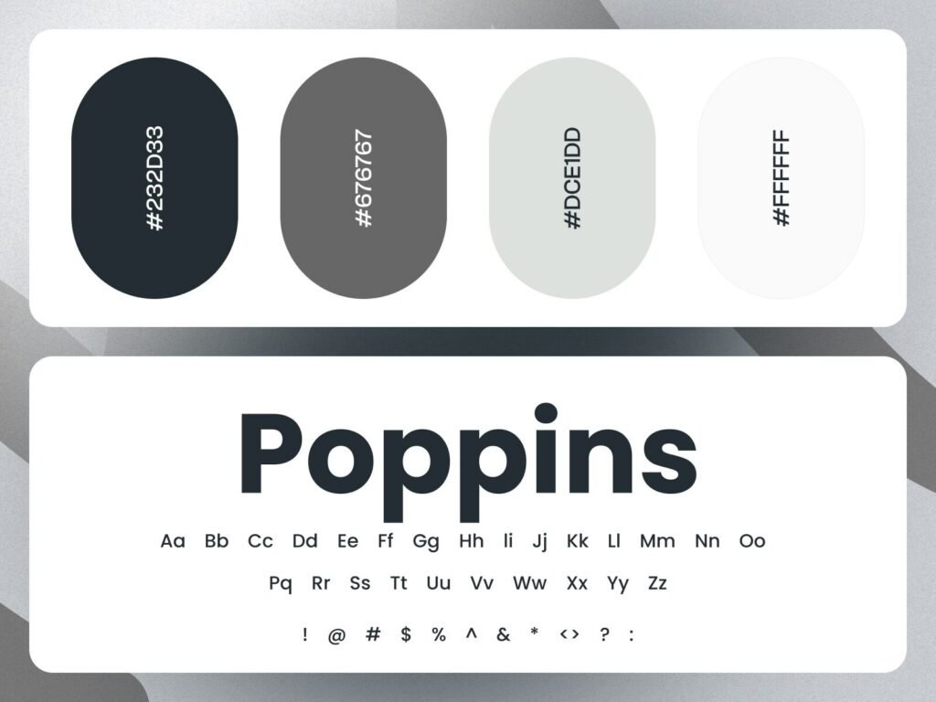
Typography & Color System (Design Consistency)
The use of the Poppins font combined with a muted color palette (#232D33, #676767, #DCE1DD, #FFFFFF) ensures excellent readability and a professional appearance.
Consistency in typography and colors:
- Enhances brand recognition
- Improves accessibility
- Creates visual harmony
These design fundamentals are critical for scalable custom website design for music academies.
How Devoq Design Translates Visual Strategy into Performance
The Artistry design reflects how Devoq Design builds platforms that balance creativity with usability. Instead of designing only for visuals, the layouts prioritize:
✔ User journey flow
✔ Conversion optimization
✔ Mobile responsiveness
✔ SEO-friendly structure
✔ Brand storytelling
This approach ensures the website performs well both in search rankings and user engagement.
Key Takeaways Before You Start Designing
If you’re planning your own music academy website design, consider these practical lessons from the shared visuals:
- Lead with emotional hero visuals
- Keep navigation simple and intuitive
- Structure courses clearly
- Highlight trust elements
- Optimize mobile experience
- Use consistent typography and colors
- Showcase events and gallery content
These principles help build a powerful online music class website design that attracts and converts users effectively.
Conclusion
A successful music website blends art with strategy. The Artistry UI demonstrates how visual clarity, structured layouts, and emotional storytelling can elevate digital presence for music institutes.
Whether you’re building a new platform or redesigning an existing one, investing in a professionally crafted modern music academy website design can significantly increase enrollments and brand authority.
With creative expertise and user-focused execution, Devoq Design continues to help brands build digital experiences that resonate, perform, and scale.