Introduction
Healthcare platforms today are no longer just informational websites. They are digital care systems where patients book appointments, consult doctors online, check symptoms, and manage health data. That’s why medical website UI UX design plays a critical role in trust, usability, and adoption.
The Adiba platform designed by Devoq Design is a strong example of how thoughtful UI/UX can transform a healthcare idea into a scalable, patient-friendly digital product. This guide explains how to design a modern healthcare website using image-wise analysis, written in a professional, non–case study style so startups, founders, and healthcare teams can easily understand and apply these ideas.
1.Hero Section: Vision-Driven Healthcare Website Design
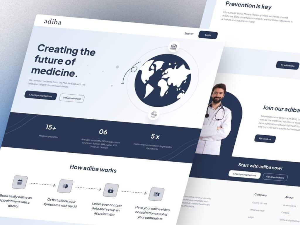
The hero section introduces the platform’s mission: creating the future of medicine. A global visual combined with a calm blue palette immediately builds credibility and reassurance essential for any healthcare website design.
Why this UI works
- Clear value proposition above the fold
- Strong primary CTAs: Check symptoms and Get appointment
- Medical-safe colors that signal trust and care
- Global healthcare positioning for wider reach
For online doctor consultation website design, this clarity reduces hesitation and encourages first interaction.
2.Statistics & Credibility Section
This section highlights numbers like medical specialties, countries served, and faster diagnosis metrics. In healthcare, data builds trust.
UX & SEO benefits
- Establishes authority instantly
- Supports decision-making for new users
- Improves engagement and scroll depth
A strong digital healthcare platform design always balances emotion with evidence.
3.How Adiba Works Process Flow
This step-by-step flow explains the user journey from booking to video consultation. Simple icons and spacing make the experience easy to understand for all age groups.
Why this matters
- Reduces cognitive load
- Improves onboarding
- Increases appointment completion rates
This is a core element of medical website UI UX design for telehealth platforms.
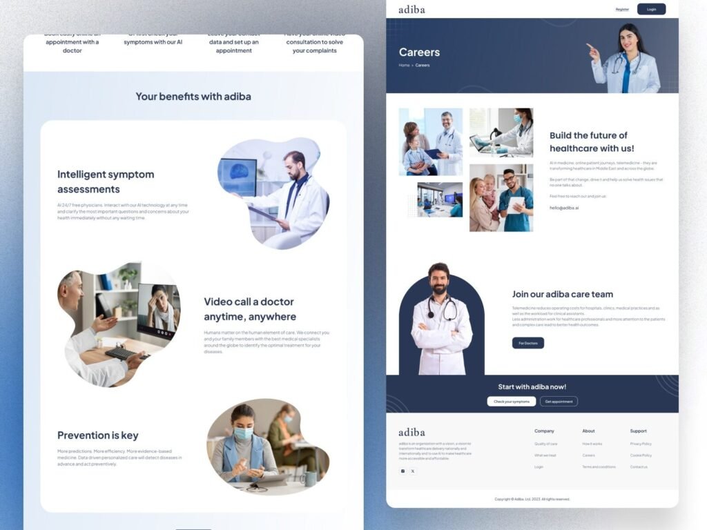
4.Benefits Section: Smart Healthcare Features
This section highlights intelligent symptom assessment, video consultations, and preventive care messaging.
UX strengths
- Feature-based storytelling
- Human-centered visuals
- Clear benefit-oriented copy
For a smart healthcare platform design, explaining why features matter is more important than listing them.
5.Prevention-Focused Content Block
The “Prevention is key” message positions the platform as proactive, not reactive. This aligns with modern digital health trends.
Why it works
- Encourages long-term engagement
- Supports preventive healthcare SEO topics
- Builds thought leadership
Strong healthcare website design always educates, not just converts.
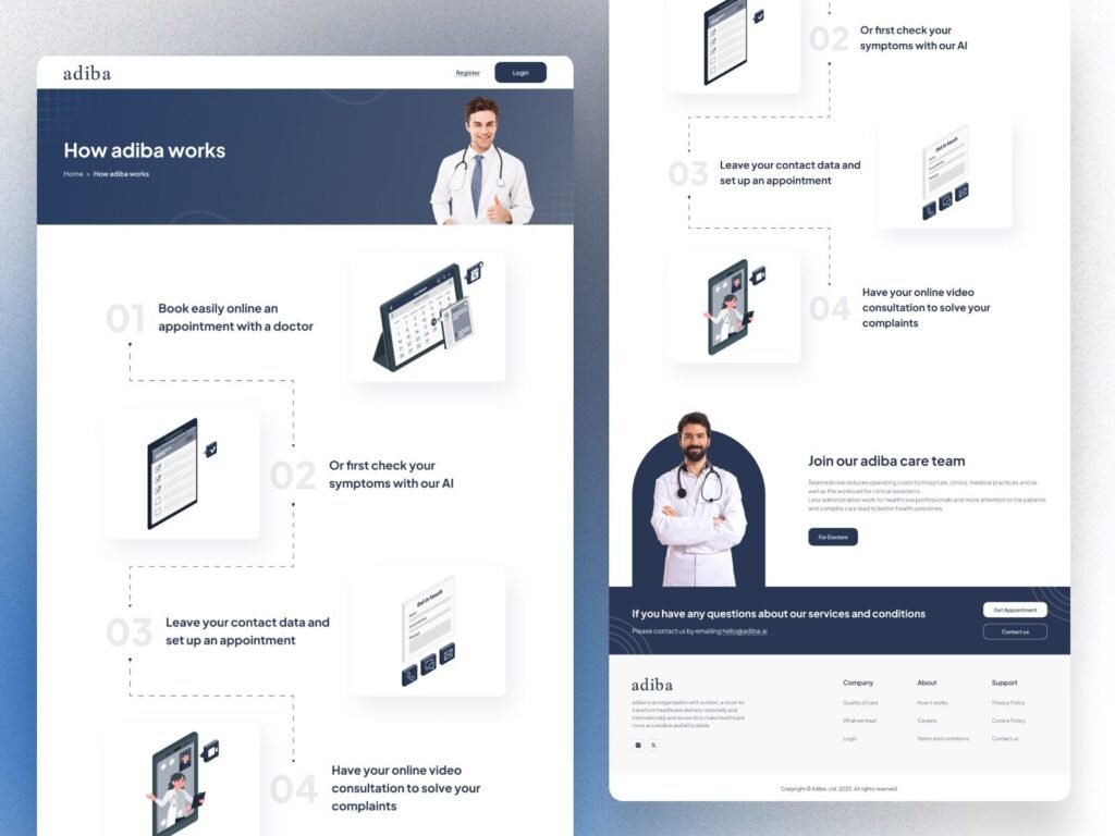
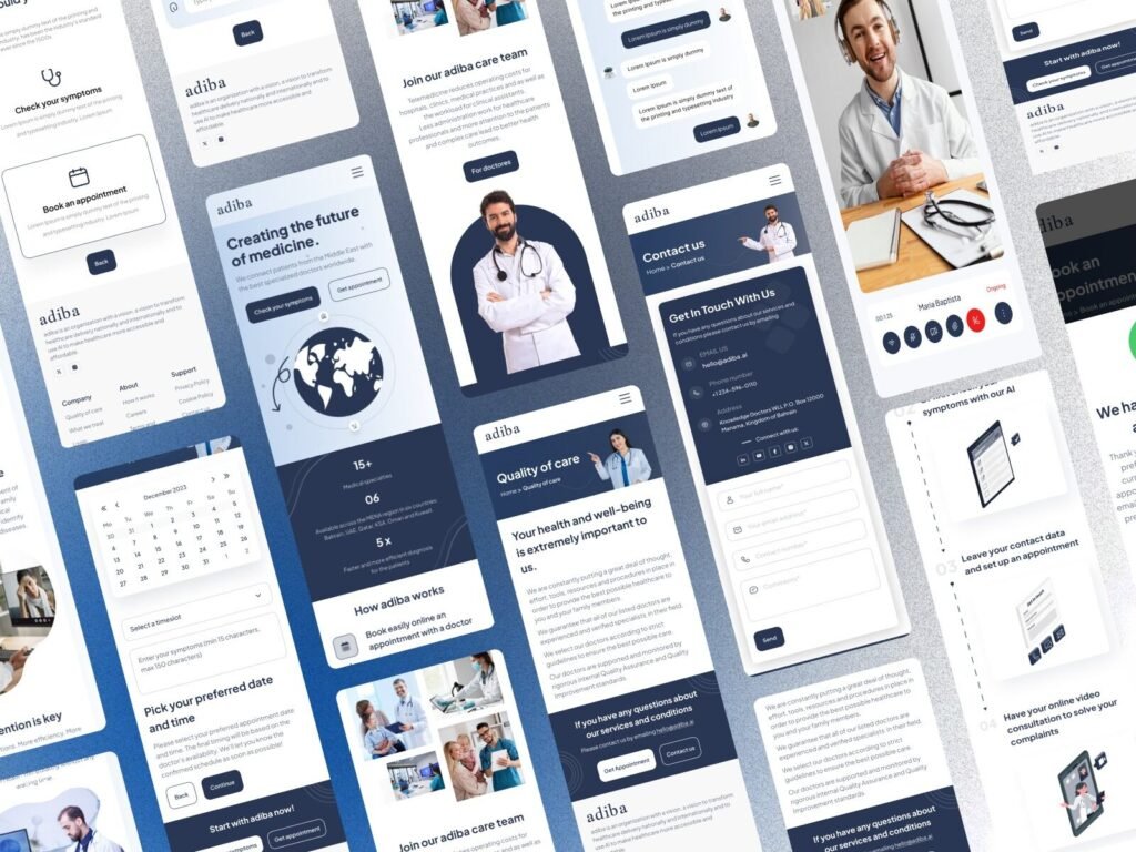
6. Careers & Team Page Design
Healthcare platforms must appeal to both patients and professionals. This page focuses on doctors, medical staff, and healthcare partners.
UX impact
- Professional tone and imagery
- Clear “For Doctors” CTA
- Supports platform growth and hiring
This is an often-overlooked part of healthcare UI UX design services.
7.Contact & Support Page
A clean contact interface reassures users that help is available. Simple forms, visible contact details, and friendly layout reduce friction.
Why this matters
- Improves trust
- Increases inquiries
- Supports patient confidence
Essential for online doctor consultation website design.
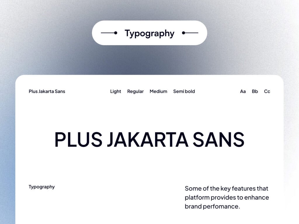
8. Typography System (Plus Jakarta Sans)
Typography affects readability, accessibility, and trust. The chosen font family is modern, neutral, and highly readable across devices.
Design benefits
- Improves content scanning
- Supports accessibility standards
- Maintains professional tone
Typography is a foundation of effective medical website UI UX design.
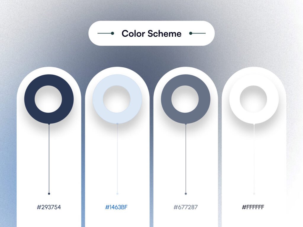
9.Color Scheme for Healthcare UI
The blue-gray palette reflects calmness, safety, and reliability key emotions in healthcare experiences.
Why this palette works
- Reduces anxiety
- Improves visual hierarchy
- Aligns with medical branding norms
Color psychology plays a vital role in healthcare website design.
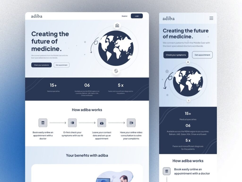
9.Responsive & Mobile Experience
Adiba’s mobile layouts ensure patients can book appointments and consult doctors from any device. Responsive design is essential for today’s healthcare users.
Mobile UX advantages
- Better SEO performance
- Higher engagement
- Accessibility for all users
A strong digital healthcare platform design is always mobile-first.
Why Devoq Design Excels in Healthcare UI UX Design
Devoq Design specializes in creating scalable, user-focused digital products for healthcare startups and enterprises. Their approach blends:
✔ Healthcare-compliant UI principles
✔ Patient-first UX strategy
✔ Clean, modern visual systems
✔ SEO-ready architecture
✔ Scalable design for future growth
Whether it’s a medical website UI UX design or a full smart healthcare platform, Devoq Design focuses on clarity, trust, and usability.
Key Takeaways for Healthcare Startups
When designing a healthcare platform, focus on:
- Simple onboarding
- Clear CTAs
- Trust-building visuals
- Educational content
- Responsive layouts
- Accessible typography
- Calm color systems
These elements help platforms rank better and convert users more effectively.
Conclusion
A successful medical website UI UX design is not about visual beauty alone it’s about confidence, clarity, and care. The Adiba platform demonstrates how thoughtful design can support online consultations, preventive healthcare, and global medical access.
For startups and healthcare businesses planning a digital healthcare platform design, partnering with experienced teams like Devoq Design ensures long-term usability, scalability, and Google-friendly performance.