The fintech industry is rapidly evolving, and with it, the expectations of users interacting with trading platforms are also changing. A modern fintech website UI design is no longer just about aesthetics it’s about building trust, simplifying complex financial processes, and driving conversions.
In this blog, we explore a powerful fintech SaaS platform UI for capital funding businesses, designed by Devoq Design for The Upside Funding. This design demonstrates how strategic UI/UX decisions can transform a trading platform into a high-converting digital product.
1. High-Converting Fintech Hero Section Design
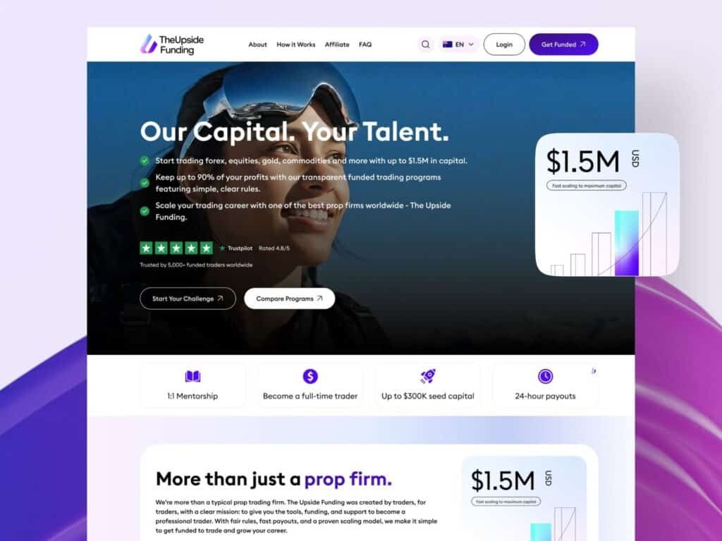
The hero section is one of the most critical parts of any fintech website UI design, especially for trading platforms and prop firms. In this design created by Devoq Design for The Upside Funding, the hero section is strategically crafted to immediately communicate value, build trust, and drive user action.
The headline, “Our Capital. Your Talent.”, is bold, clear, and benefit-driven. It directly speaks to traders by highlighting the core offering—access to significant capital. This kind of messaging is essential in investment platform UI design, where users are primarily focused on growth opportunities and financial potential.

A high-converting fintech hero section showcasing funded trading opportunities, trust signals, and strong call-to-action design.
2. Building Trust with Fintech UI Design
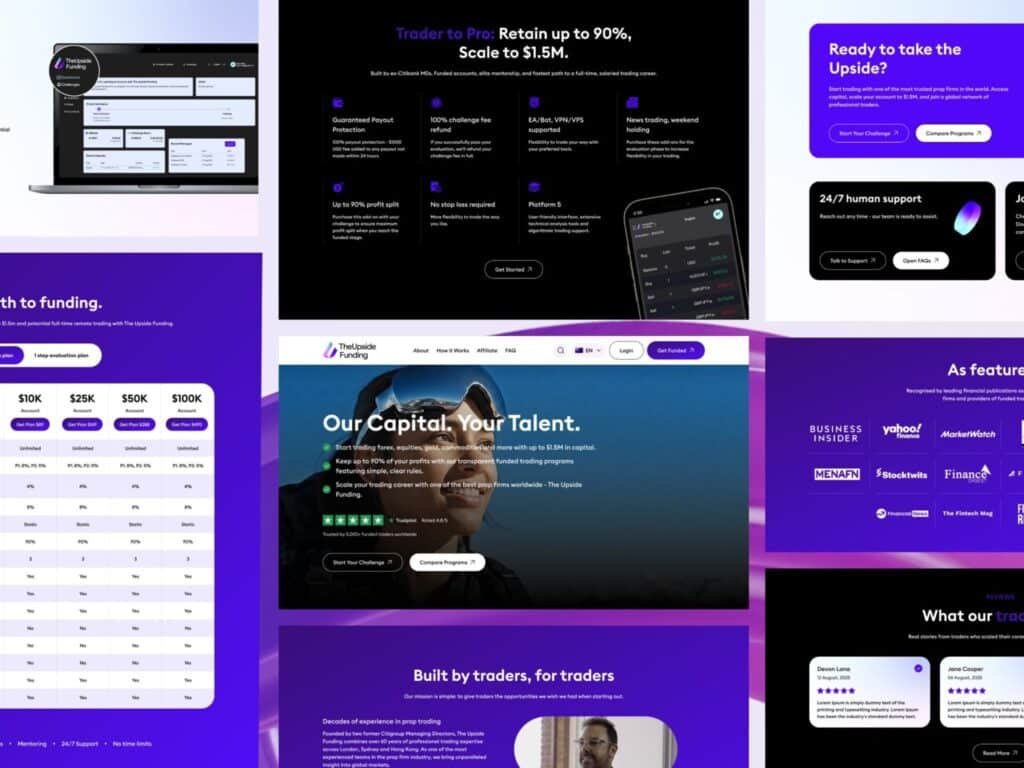
Trust isn’t optional—it’s everything. This section of The Upside Funding platform, designed by Devoq Design, focuses heavily on establishing credibility through strategic UI elements.
The “As featured in” section displays well-known financial media logos like Business Insider and Yahoo Finance. This instantly boosts user confidence and positions the platform as a recognized and reliable brand. In financial services website design, such trust badges act as powerful psychological triggers that reduce hesitation and increase conversions.
A complete fintech platform UI showcasing trust signals, feature highlights, community engagement, and conversion-focused sections.
3. CTA, Community & Support Sections
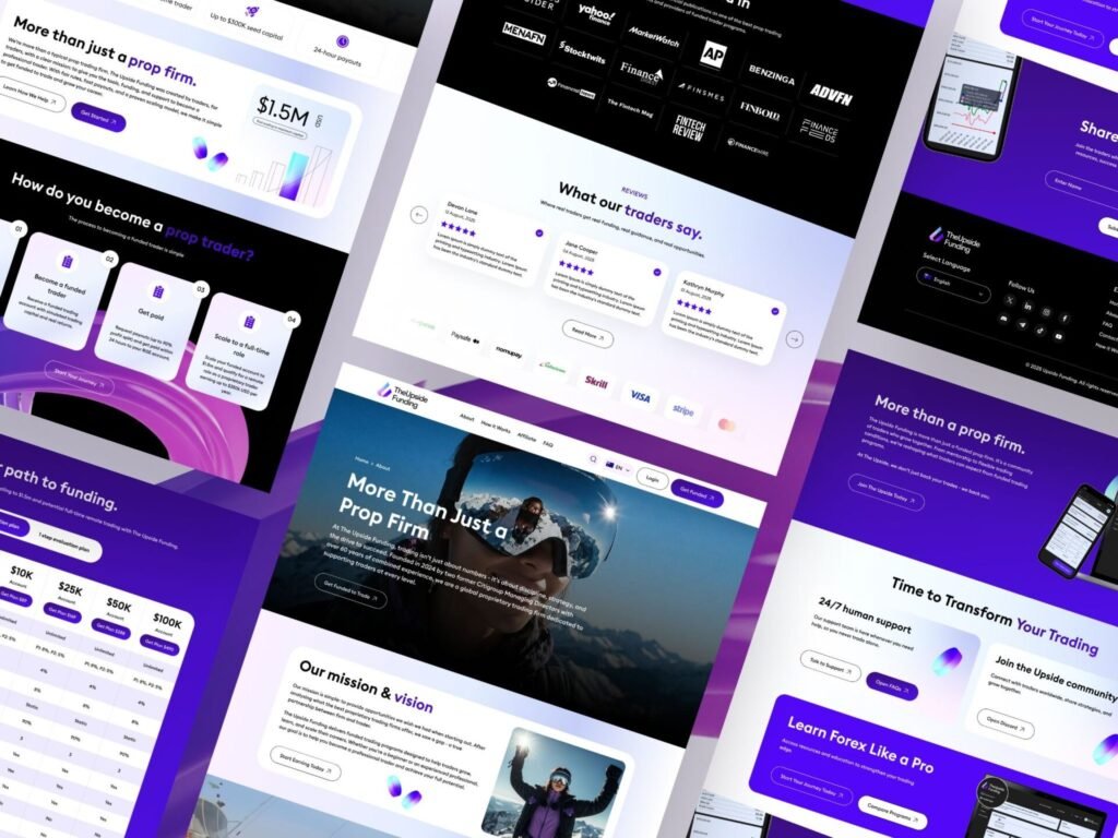
One of the standout elements in this fintech website UI design is its strong focus on conversion. Clear CTAs like “Start Your Challenge” and “Compare Programs” are strategically placed to guide users toward action.
Additionally, sections like “Join the Community” and “24/7 Support” build trust and credibility. In the fintech space, users need reassurance before committing, and these elements address that need effectively. This is a perfect example of how fintech SaaS platform UI for capital funding businesses can drive both engagement and trust simultaneously.
Conversion-focused CTA sections with strong messaging, community building, and 24/7 support features.
4. Mobile UI & User Journey Flow
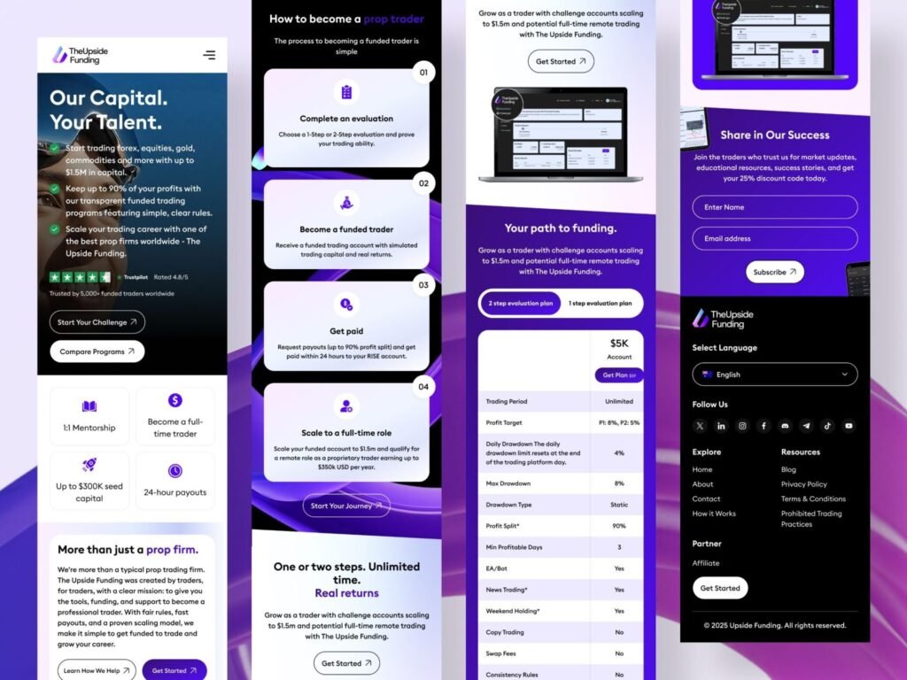
Mobile experience plays a crucial role in today’s fintech SaaS website design, and this layout highlights a seamless user journey. From onboarding to becoming a funded trader, each step is visually structured and easy to follow.
The design breaks down complex trading processes into simple stages like evaluation, funding, and payouts. This improves user understanding and reduces friction—key elements of a successful investment platform UI design. Devoq Design ensures that users feel guided at every step, increasing engagement and conversion rates.
Mobile-first fintech UI showcasing the step-by-step journey from evaluation to becoming a funded trader.
5. Trust, Testimonials & Social Proof
Trust is everything in fintech. This section integrates testimonials, ratings, and media mentions to establish credibility. By showcasing real user feedback and recognizable brand logos, the platform builds confidence among new users.
Such elements are essential in financial services website design, as they reduce hesitation and encourage users to move forward. Devoq Design smartly integrates these trust signals into the UI without cluttering the layout.
User testimonials and trusted brand logos enhance credibility in fintech platform design.
6. Typography & Color System
A strong visual foundation is critical in financial services website design, and this UI starts with a refined typography and color system. The use of Euclid Square font ensures clarity and readability across devices, which is essential when dealing with financial data and trading information.
The color palette—dominated by purple gradients—represents trust, innovation, and financial growth. Supporting shades like lavender, black, and white create a balanced contrast, improving accessibility and visual hierarchy. This thoughtful combination enhances the overall modern fintech landing page design, making the interface both engaging and professional.
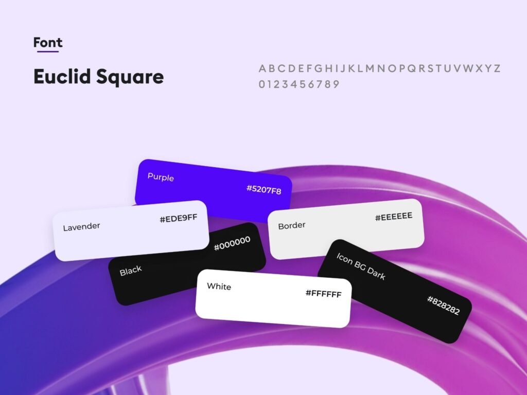
A clean typography and modern purple-based color system designed for a fintech SaaS platform to enhance trust and usability.
Conclusion
A successful fintech website UI design is not just about visual appeal—it’s about creating a seamless, trustworthy, and conversion-focused experience.
This project by Devoq Design for The Upside Funding perfectly demonstrates how thoughtful UI/UX can transform a trading platform into a powerful digital product. By combining clarity, trust, and modern design principles, fintech platforms can significantly improve user engagement and business growth.