Introduction: Why E-Learning Website Design Matters More Than Ever
The e-learning industry is growing faster than ever, but most education websites fail to convert visitors into enrolled students. The reason isn’t content-it’s poor e-learning website design.
Users today expect:
- Fast-loading pages
- Clear course discovery
- Trust-building layouts
- Mobile-friendly learning platforms
- Simple enrollment journeys
When these expectations are not met, users leave within seconds.
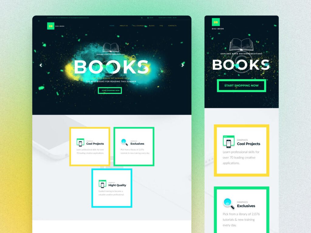
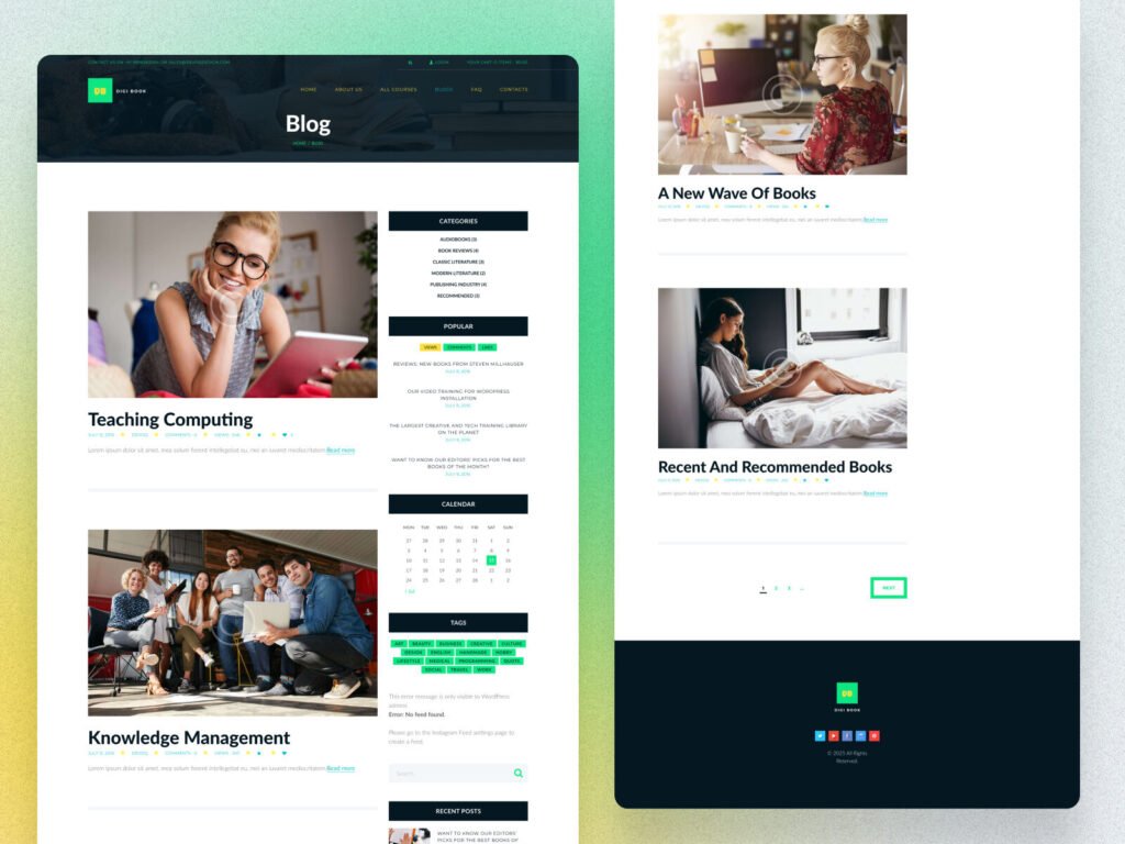
Projects like DigiBook, designed by Devoq Design, clearly show how modern e-learning website design can solve these problems. This blog explains what actually works, why users drop off, and how the right design turns interest into enrollments.
Common Pain Points in Poor E-Learning Website Design
Before understanding solutions, let’s look at real user problems:
- Confusing course navigation
- Overloaded content with no visual hierarchy
- Weak CTAs that don’t guide users
- Poor mobile experience
- Slow performance and cluttered layouts
- No trust signals (reviews, instructors, credibility)
A professional e-learning platform website design fixes these issues at the design level.
Key Features of High-Converting E-Learning Website Design
1. Clear Visual Hierarchy for Learning Platforms
A successful online course website design guides users visually. Headings, spacing, color contrast, and CTAs must work together.
In DigiBook-style layouts:
- Important sections stand out instantly
- Users understand where to click next
- Learning paths feel structured, not overwhelming
This is critical for student retention and conversions.
2. Strong Hero Section That Explains Value Instantly
Your homepage must answer three questions in 5 seconds:
- What is this platform?
- Who is it for?
- Why should I join?
Modern e-learning website design uses bold typography, clean visuals, and a focused CTA—exactly what DigiBook demonstrates.
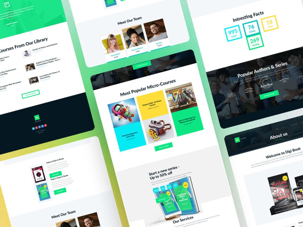
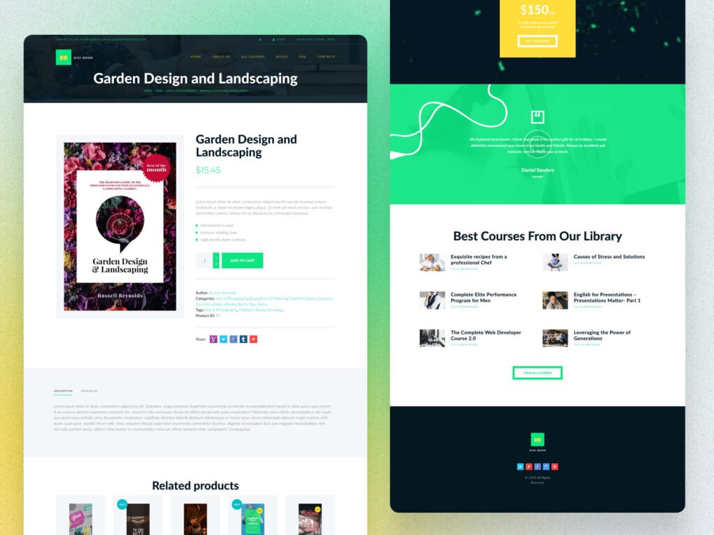
3. Course Discovery That Feels Effortless
Students don’t want to search endlessly.
Effective education website design includes:
- Category-based course listings
- Popular & recommended sections
- Micro-courses for quick learning
- Visual course cards with clear outcomes
This reduces bounce rate and increases enrollments.
4. Mobile-First Learning Experience
More than 60% of learners access courses on mobile devices.
If your e-learning platform website design isn’t mobile-optimized, you lose leads instantly.
Responsive layouts, touch-friendly buttons, and optimized reading experiences are essential – and fully implemented in DigiBook-style designs by Devoq Design.
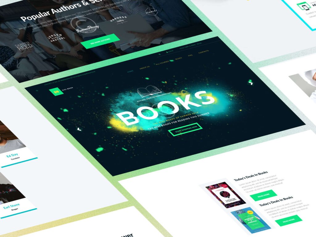
5. Trust-Building Elements That Convert Users
Trust is critical in online education.
High-performing online course website design includes:
- Instructor profiles
- Student testimonials
- Ratings & reviews
- Clean UI with consistent branding
These elements reduce hesitation and encourage enrollment.
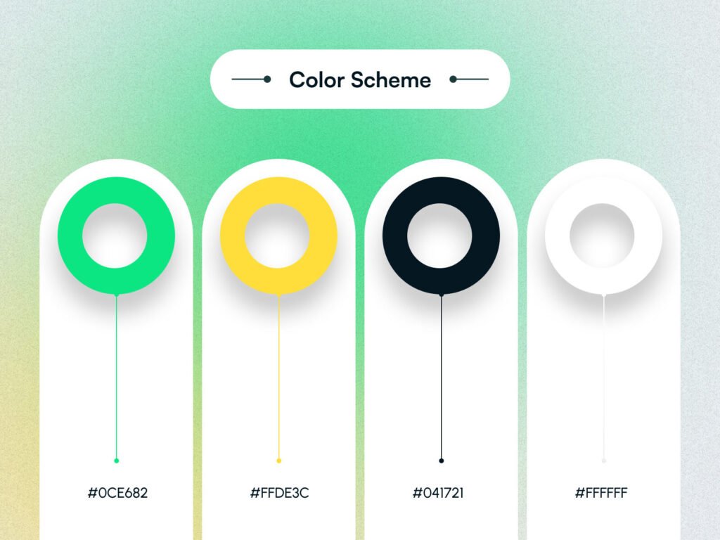
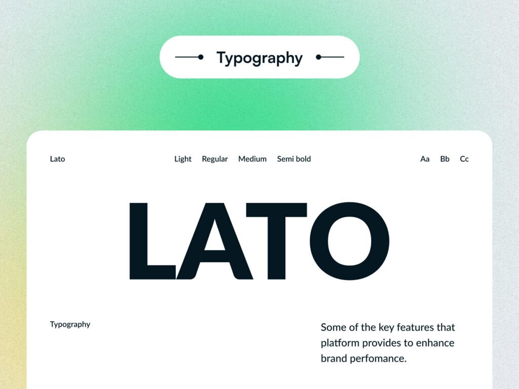
6. Smart Use of Color & Typography
Design isn’t decoration-it’s psychology.
Effective e-learning website design uses:
- Calm, readable color schemes
- High-contrast CTAs
- Professional typography for long reading sessions
This improves readability, engagement, and learning comfort.
7. Blog & Content Sections for Organic Traffic
An optimized blog section helps:
- Rank for education-related keywords
- Build authority
- Educate users before conversion
DigiBook-style blog layouts show how education website design supports long-term SEO growth.
Conclusion:
If your current education website:
- Gets traffic but no sign-ups
- Looks outdated
- Feels confusing to users
- Doesn’t rank on Google
Then it’s not a content problem-it’s a design problem.
A professionally built e-learning platform website design, like DigiBook by Devoq Design, can transform casual visitors into loyal students.
Why Choose Devoq Design for E-Learning Website Design?
At Devoq Design, we don’t just design websites-we design conversion-focused learning experiences.
Our approach:
- User-first UX strategy
- SEO-optimized structure
- Mobile-first layouts
- Conversion-driven CTAs
- Scalable e-learning platforms
Projects like DigiBook reflect how our e-learning website design services help education brands grow traffic, trust, and enrollments.