
A Modern Financial Advisor Website Design Focused on Trust, UX, and Conversion
A financial advisor’s website is often the first place potential clients go to understand a brand, explore its services, and decide whether to take the next step. That first impression can have a significant impact on whether a visitor continues exploring or leaves the website.
For this project, the goal was to create a modern financial website experience that feels professional, approachable, and easy to navigate while keeping conversion at the center of the design.
The concept combines a strong visual identity, clear messaging, dashboard-style interfaces, responsive layouts, testimonials, FAQs, and strategically placed calls to action.
In this case study, we’ll explore the design approach behind the project and how thoughtful financial advisor website design can turn a website from a simple digital presence into a conversion-focused experience.
Turning Website Visitors Into Qualified Leads
A visually polished website is only successful when it helps users take meaningful action.
For Devoq.io, the focus isn’t just on creating attractive interfaces. The goal is to design digital experiences that support measurable business outcomes.
For a financial advisor website, this means creating clear pathways from the first interaction to a potential consultation.
A conversion-focused experience can include:
- Clear primary CTAs
- Short and simple contact forms
- Strategic CTA placement
- Trust-building content
- Easy-to-find contact information
- Focused landing pages
- Clear service descriptions
- Mobile-friendly interactions
- Strong visual hierarchy
Instead of placing the same CTA repeatedly throughout the page, we can introduce actions at natural decision points.
Understanding the Challenge
Financial websites often need to communicate a lot of information. Services, financial data, features, testimonials, processes, and FAQs can quickly make a page feel overwhelming.
The challenge was to create an experience that could communicate this information without making the interface complicated.
The design needed to feel:
- Professional and trustworthy
- Modern and visually engaging
- Simple to understand
- Easy to navigate
- Responsive across devices
- Focused on meaningful user actions
The solution was to organize the experience around a clear user journey and use visual hierarchy to guide attention from one section to the next.
1. Creating a Strong First Impression With the Hero Section
The hero section establishes the visual language and message of the entire website.
For this design, we used a large, confident headline supported by concise copy and two clear calls to action. Instead of filling the first screen with information, the layout gives the primary message enough space to stand out.
The financial dashboard visual on the right provides an immediate representation of the digital experience.
This combination helps communicate both the brand’s message and the product experience without requiring users to scroll.
Key design elements
- Strong headline hierarchy
- Short supporting message
- Primary and secondary CTAs
- Dashboard product visual
- Minimal navigation
- Generous whitespace
- Rounded interface elements
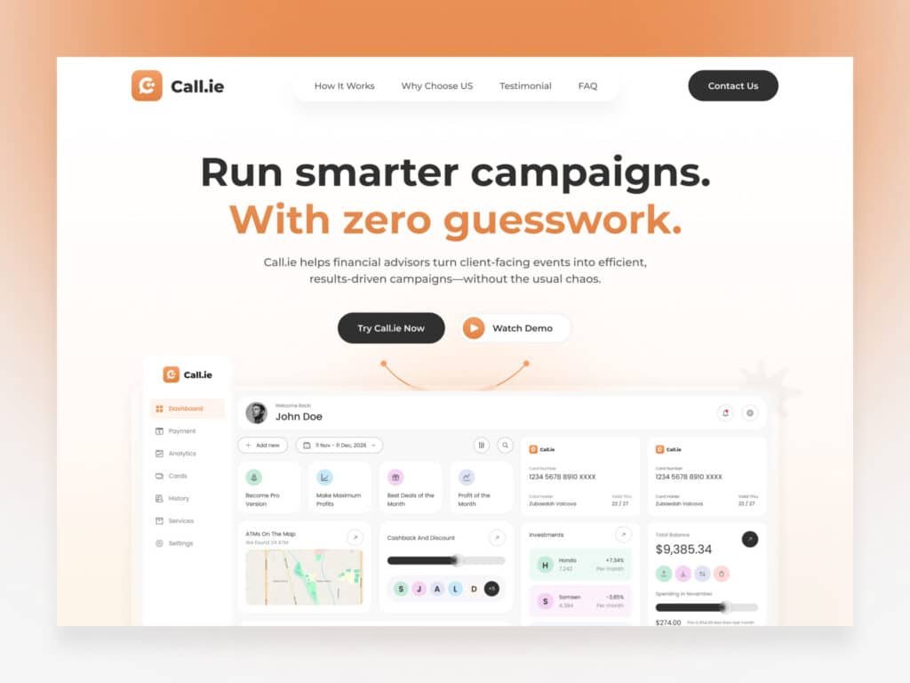
Financial Advisor Website Design
A conversion-focused financial advisor website hero section combining clear messaging, strong CTAs, and a modern dashboard visual.
2. Building a Complete Landing Page Experience
A successful landing page needs to do more than attract attention. It needs to guide visitors through the information they need before asking them to take action.
The page was structured as a continuous journey rather than a collection of disconnected sections.
Starting with the hero, visitors move through:
- How the experience works
- Key benefits
- Supporting content
- Testimonials
- FAQs
- Final CTA
- Footer navigation
This approach makes financial advisor landing page design more intentional. Each section has a role in answering questions and gradually building confidence.
The “How It Works” section, for example, helps simplify the process into understandable steps, while testimonials provide social proof further down the page.
The final CTA then gives users a clear opportunity to continue.
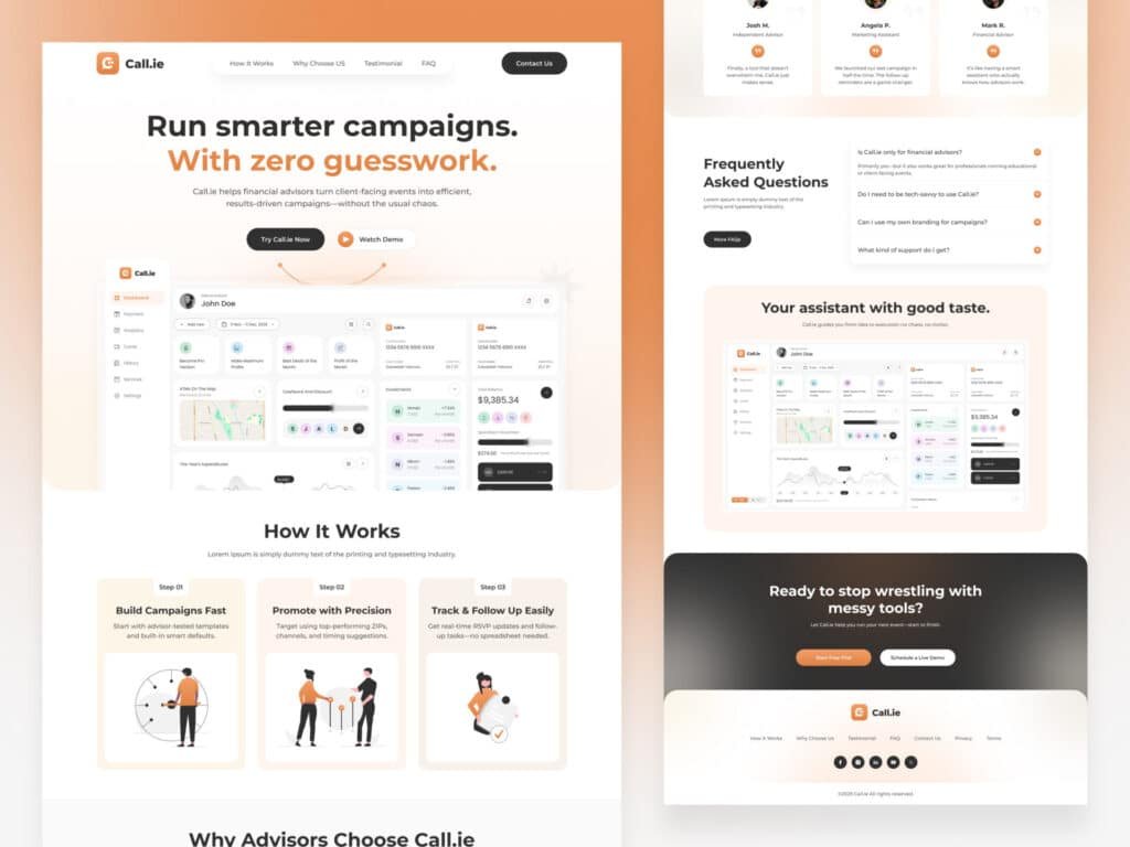
Financial Advisor Landing Page Design
A complete financial advisor landing page design structured to guide visitors from the initial introduction through trust-building content and conversion.
3. Designing a Responsive Financial Advisor Website UX
Financial websites need to work across different screen sizes without compromising the experience.
For this project, the desktop and mobile layouts were designed as part of the same system. Instead of simply shrinking the desktop design, elements were reorganized to maintain readability and usability on smaller screens.
Navigation, typography, buttons, dashboard visuals, cards, and spacing all adapt to the available screen size.
This is an important part of financial advisor website UX because visitors should be able to understand the same core information whether they’re using a desktop, tablet, or smartphone.
Responsive design considerations
- Simplified mobile navigation
- Flexible typography
- Adaptable content sections
- Touch-friendly CTAs
- Responsive dashboard visuals
- Optimized spacing
- Consistent visual hierarchy
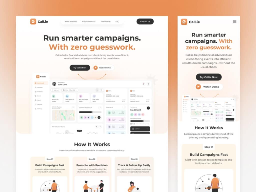
Responsive Financial Advisor Website UX
Responsive financial advisor website UX designed to provide a consistent experience across desktop and mobile devices.
The desktop and mobile comparison highlights how a well-planned responsive system can preserve the personality of the original design while adapting the experience to different devices.
4. Simplifying Financial Information With Dashboard UI
Financial information can be complex, particularly when users need to understand multiple metrics or pieces of information at once.
The dashboard interface was designed to make that information easier to scan by organizing it into clear visual components.
The interface uses:
- Metric cards
- Data visualizations
- Progress indicators
- Project information
- User details
- Testimonials
- FAQ components
- Clear navigation
Rather than presenting everything as text, the interface uses visual hierarchy to distinguish primary information from supporting details.
This makes the dashboard easier to understand while giving the website a stronger connection to the underlying digital product.
Good financial advisor website UX should make complex information feel manageable, and structured dashboard components are an effective way to achieve that.
Financial Advisor Dashboard UX
Financial advisor dashboard UX using structured cards, metrics, and visual components to make financial information easier to understand.
The dashboard visual also adds depth to the website’s storytelling. Instead of simply telling visitors about the product, the design gives them a visual preview of the experience.
5. Establishing a Consistent Visual Design System
A strong website needs consistency across typography, colors, spacing, and components.
For this project, the visual system combines a clean typographic hierarchy with a warm, modern color palette.
Typography
Montserrat was used as the primary typeface to create a clean and contemporary appearance.
The hierarchy differentiates:
- Main headlines
- Section headings
- Supporting text
- Labels
- Buttons
- Navigation
This makes the interface easier to scan while maintaining a consistent brand personality.
Color system
The palette combines:
- Orange
- Peach
- Cream
- Dark gray
- White
The orange accent provides visual emphasis for important interactive elements, while the neutral backgrounds keep the interface clean and balanced.
UI components
The system also defines reusable components such as:
- Buttons
- Cards
- Metrics
- Navigation
- FAQ accordions
- Testimonials
- Dashboard elements
- CTA sections
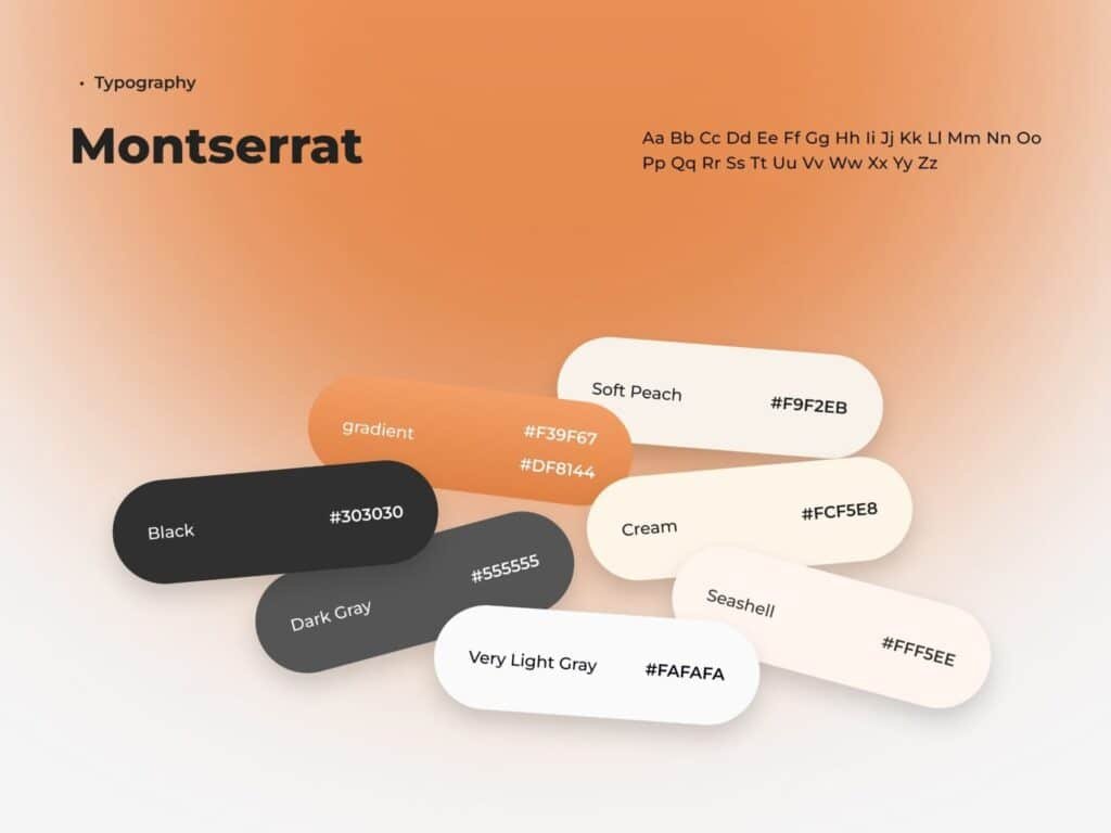
Financial Advisor Website Design System
Financial advisor website design system defining typography, colors, and reusable UI components for a consistent digital experience.
Rethinking the Experience Through Financial Advisor Website Redesign
A financial advisor website redesign shouldn’t simply replace an old color palette or update a few images.
It should provide an opportunity to rethink how users interact with the entire website.
The redesign process can focus on questions such as:
- Is the value proposition immediately clear?
- Can visitors find important information quickly?
- Are the primary CTAs easy to identify?
- Does the website communicate trust?
- Is the mobile experience as strong as desktop?
- Are complex financial concepts presented clearly?
- Does every section contribute to the user journey?
By addressing these questions before visual design begins, a redesign becomes a strategic UX improvement rather than just a visual refresh.
The result is a website that feels more intentional, easier to navigate, and better aligned with business goals.
Conclusion
Designing a financial website that converts requires more than creating a professional-looking interface.
It requires a clear understanding of how visitors discover information, build trust, evaluate a service, and ultimately decide to take action.
Through thoughtful financial advisor website design, focused financial advisor landing page design, intuitive financial advisor website UX, and a strategic approach to financial advisor website redesign, businesses can create digital experiences that are easier to understand and more effective at generating meaningful interactions.