A public speaking coaching website design is more than just aesthetics it’s about building trust, guiding users, and driving conversions.
For platforms like Clear Communication Academy, the goal is clear:
Turn hesitant visitors into confident speakers.
This is where Devoq Design plays a critical role by crafting a high-converting coaching website UI design that blends psychology, clarity, and user experience.
This blog explores how a modern communication coaching website UI design can transform user journeys and improve lead generation based entirely on the design showcased above.
1. Hero Section + Branding + CTA
The hero section is where first impressions are formed—and this design nails it.
Key Elements:
- Clear headline: “Struggling with Public Speaking?”
- Supporting value proposition
- Strong CTA: Book Your Free Discovery Call
- Professional personal branding image
UX Strategy:
✔ Clarity over creativity
✔ One clear action
✔ Trust-building visuals
Devoq Design focuses on making the user decision simple:
👉 “Do I book a call or leave?”
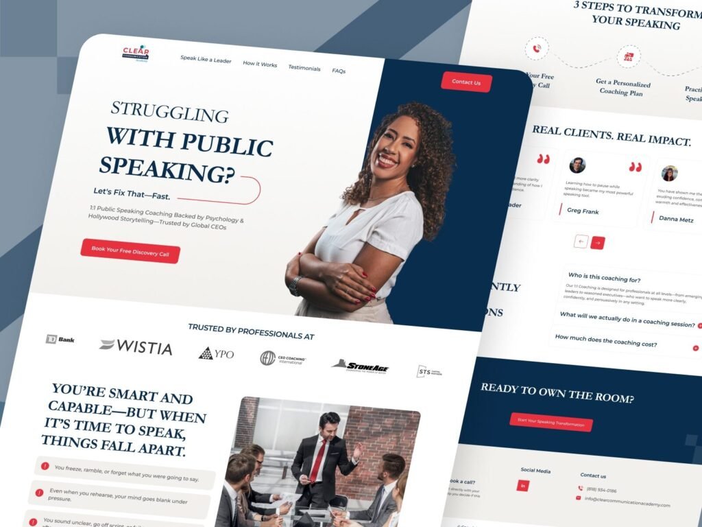
A modern coaching website hero section designed to capture attention, build trust, and encourage users to book a free discovery call.
2. Visual Layout + CTA + Flow Design
A great communication coaching website UI design follows a journey:
- Problem awareness
- Solution introduction
- Trust building
- Conversion
This layout perfectly aligns with that.
UX Highlights:
- Clean spacing & hierarchy
- Section-based storytelling
- CTA repetition for conversions
👉 This is what makes it a high-converting coaching website design.
A structured coaching website layout designed to guide users through information, trust-building, and conversion stages.
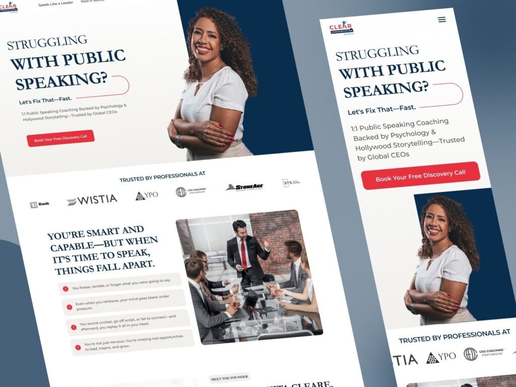
3. Responsive Design (Desktop + Mobile)
In today’s mobile-first world, responsive design is not optional.
This layout ensures:
📱 Smooth mobile navigation
💻 Clean desktop experience
⚡ Fast interaction flow
Why it matters:
- Most users visit from mobile
- Poor UX = lost leads
- Consistency builds trust
Devoq Design ensures:
👉 Same experience, every screen.
A fully responsive coaching website UI ensuring seamless user experience across desktop and mobile devices.
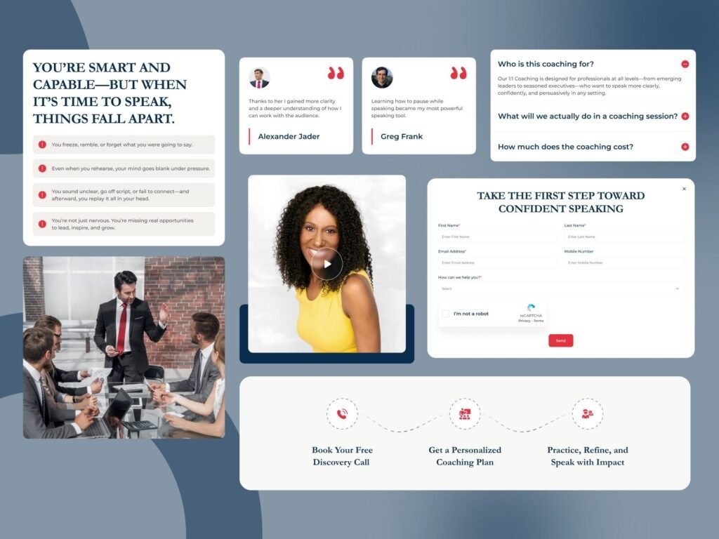
4. Problem + Trust + Conversion Section
This section is a perfect example of high-converting coaching website design.
It starts with a strong emotional hook:
👉 “You’re smart and capable—but when it’s time to speak, things fall apart.”
This messaging directly targets user pain points, making the experience relatable.
Key UX Highlights:
- 🚨 Problem-driven UI (fear, anxiety, hesitation)
- ⭐ Testimonials for instant credibility
- 📩 Lead form placed strategically for conversion
- 🎥 Video element adds human connection
This is a core principle of online coaching platform UI design:
👉 Connect emotionally first, then convert.
A conversion-focused coaching website section highlighting user pain points, testimonials, and a lead capture form to drive engagement and bookings.
5. Full Page Experience & Branding
This full-page design reflects a strong brand identity.
Key Design Elements:
- Consistent typography
- Professional color palette (blue + red trust tones)
- Balanced whitespace
- Clear visual hierarchy
Result:
✔ Strong brand recall
✔ Higher trust
✔ Better conversions
Devoq Design ensures that every section contributes to:
👉 User clarity + business growth
A complete coaching platform UI showcasing branding, layout consistency, and conversion-focused design elements.
Conclusion :
A successful public speaking coaching website design is not just about visuals it’s about guiding users toward transformation.
With this project for Clear Communication Academy, Devoq Design demonstrates how:
- UI builds trust
- UX drives decisions
- Design increases conversions
If you’re building a coaching platform, personal development website, or training business, investing in a high-converting UI/UX design is essential.