Modern relocation platforms are no longer just informational websites they are data-driven decision tools. From comparing neighborhoods to exploring lifestyle insights, users expect fast, intuitive, and highly visual experiences.
The following UI design, created by Devoq Design, demonstrates how a relocation platform (U.S. CBP concept) can combine smart search, structured dashboards and location-based insights into a seamless user journey.
This blog explores UI/UX strategies, layout decisions, and design patterns based on the provided screens helping designers and businesses build high-performing relocation platforms.
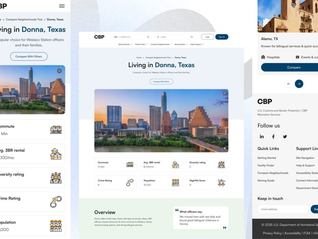
1. Hero + Location Overview UI
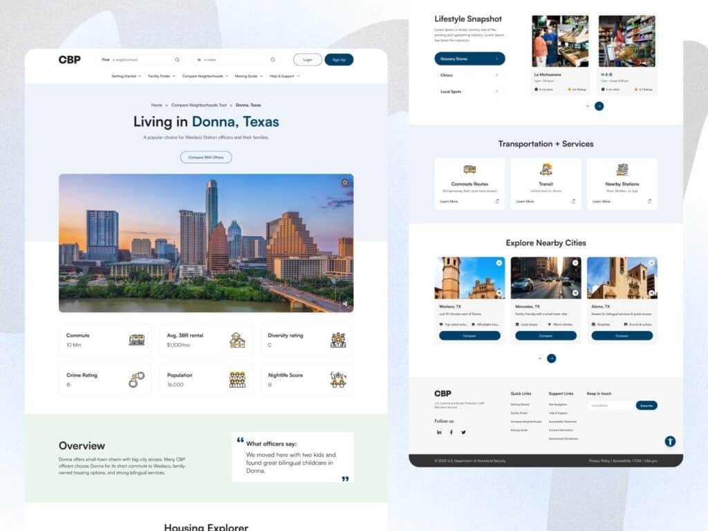
This screen highlights one of the most critical aspects of relocation platform UX design presenting complex data in a simplified way. The hero section introduces the location (Donna, Texas) while immediately offering actionable insights.
The use of visual cards for metrics such as rent, commute, and crime rating reduces cognitive load and helps users scan information quickly. This approach is essential in real estate relocation platform UI where users compare multiple factors before making decisions.
The balanced spacing, subtle colors, and structured layout reflect a trust-driven design approach, which is crucial for government and relocation-based platforms.
A clean dashboard UI displaying city-level insights like rent, commute, crime and population for better relocation decisions.
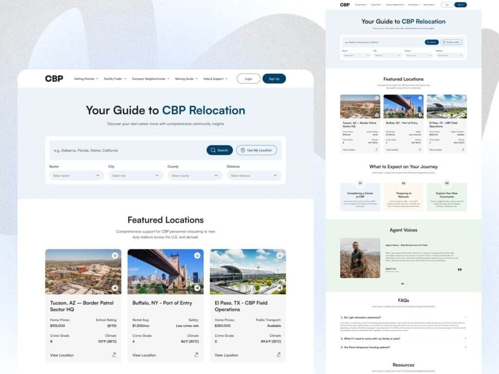
2. Search + Relocation Guide UI
Search functionality is the backbone of any location finder website design, and this UI executes it exceptionally well. The inclusion of filters like sector, city, county and distance ensures users can narrow down results precisely.
The design follows a progressive disclosure pattern, where users are not overwhelmed but still have access to advanced filtering when needed. The “Use My Location” feature adds convenience, improving overall usability.
Featured location cards further enhance exploration by combining visual appeal with data-driven insights, making this a strong example of relocation platform UX design best practices.
Advanced search and filtering system for finding ideal relocation destinations efficiently.
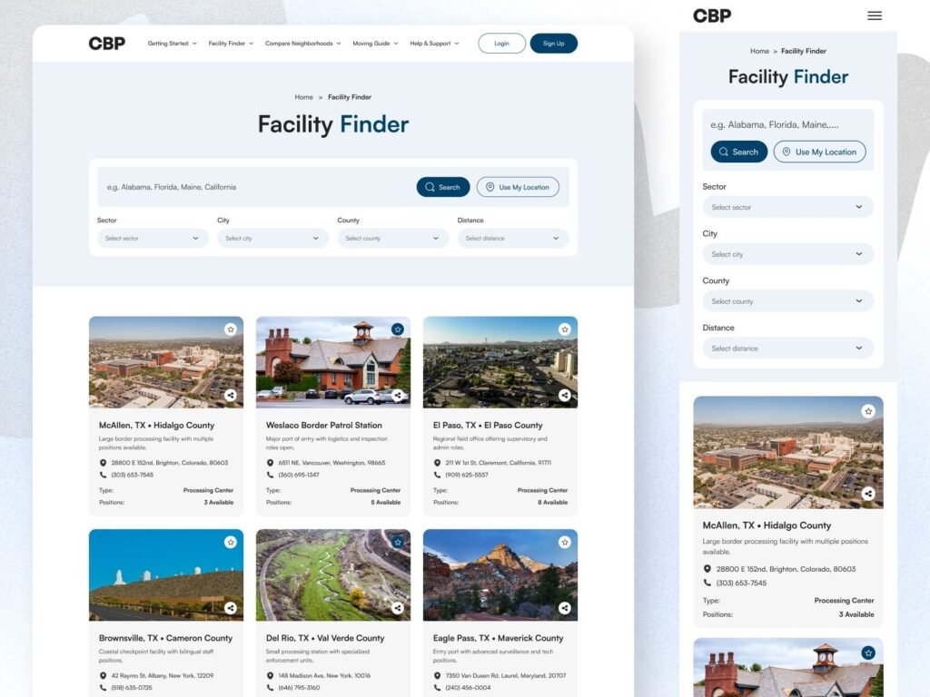
3. Facility Finder UI
This screen demonstrates how card-based UI design improves scannability and engagement. Each card includes key details such as location, type, and availability allowing users to compare options effortlessly.
The grid layout ensures consistency while maintaining visual clarity. This is especially important in real estate relocation platforms, where users often browse multiple listings.
By combining imagery with structured information, the design enhances both aesthetic appeal and usability, making it easier for users to make informed decisions.

Structured card-based UI for browsing relocation facilities and locations.
4. Lifestyle & Services UI
Relocation decisions go beyond data users also need lifestyle insights. This section provides information about grocery stores, clinics and local spots, creating a more human-centered experience.
The categorized layout ensures users can explore different aspects of a city without confusion. This aligns with modern UX design principles, where emotional and practical needs are both addressed.
Including lifestyle data transforms a platform from a data tool into a decision-making ecosystem.
Lifestyle and services section helping users understand the real experience of a location.
5. Typography & Color System
Typography and color play a crucial role in UX clarity and brand trust. The use of a modern sans-serif font like Satoshi ensures readability across devices.
The color palette combines neutral tones with subtle blues and greens, creating a calm and professional interface. This is particularly effective for government and relocation platforms, where trust and clarity are essential.
A well-defined design system also ensures scalability, making it easier to expand features without breaking visual consistency.
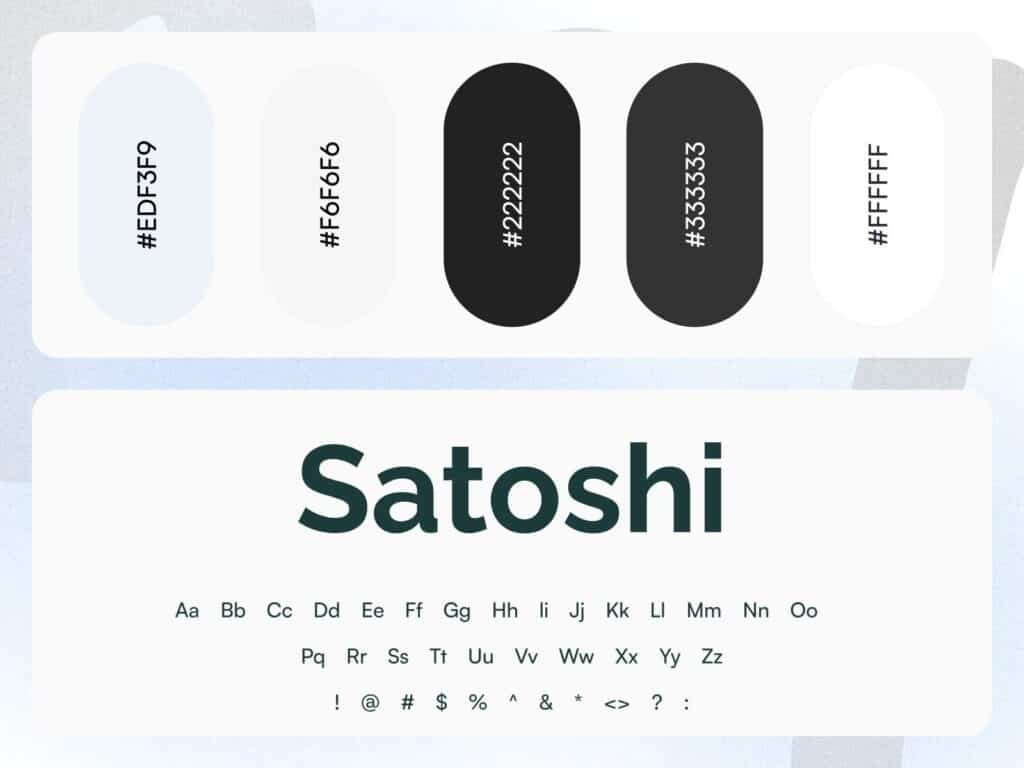
A clean typography and color system ensuring consistency and readability across the platform.
6. City Overview Dashboard UI
This screen is a strong example of how relocation platform UX design should simplify complex data. The layout highlights “Living in Donna, Texas” with a clean hero section followed by structured data cards.
Each metric commute time, rent, crime rating, population, and nightlife is presented in a digestible card format, allowing users to scan information quickly without feeling overwhelmed. This is crucial for location finder website design, where users often compare multiple cities.
The use of whitespace, soft color tones, and clear typography ensures readability and builds trust especially important for platforms like U.S. CBP relocation systems. Designed by Devoq Design, this UI reflects a balance between data density and visual clarity.
A modern relocation dashboard presenting key city insights for faster and smarter decision-making.
7. Welcome to Weslaco Station
This screen introduces map-based UX integration, which is a key feature in modern real estate relocation platform UI. By combining visual maps with location-specific images and quick facts, users get both context and clarity.
The “Quick Facts” section (location, staff, area, work schedule, commute range) transforms raw data into actionable insights. Instead of reading long descriptions, users can instantly understand the environment.
The inclusion of CTA buttons like “Compare Neighborhoods” and “Start Relocation Checklist” improves user flow and encourages engagement a smart move in conversion-focused UX design.
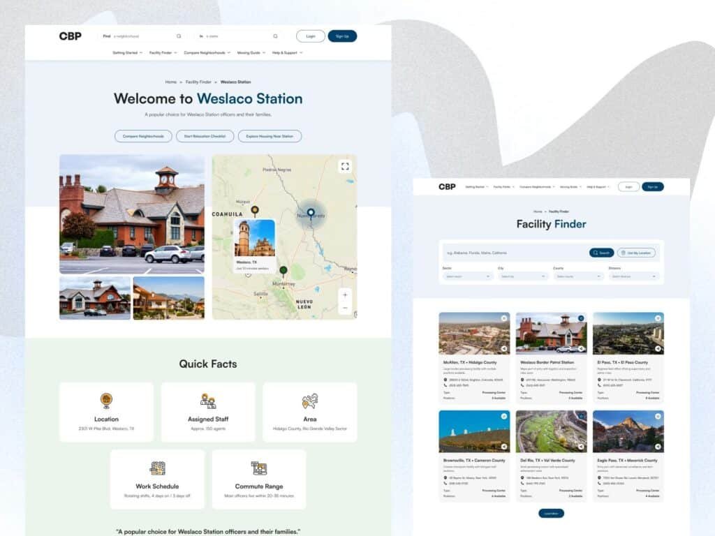
Interactive map and quick facts section enhancing location understanding and decision-making.
8. Lifestyle Snapshot + Nearby Cities
Relocation decisions are not purely data-driven they are deeply connected to lifestyle. This UI section solves that by introducing lifestyle snapshots including grocery stores, clinics, and local spots.
The categorized layout ensures users can easily explore different aspects of daily life. This approach aligns with human-centered UX design, where emotional and practical needs are addressed together.
The “Explore Nearby Cities” section adds another layer of usability by enabling quick comparisons. Instead of navigating away, users can discover alternative options within the same flow.
Additionally, the Transportation & Services cards enhance usability by providing essential infrastructure details — making the platform feel complete and reliable.
Lifestyle insights and nearby city exploration features enhancing user decision-making experience.
Conclusion
A well-designed relocation platform is a blend of data, usability, and emotional connection. By integrating smart search, structured dashboards, and lifestyle insights, designers can create experiences that truly help users make confident decisions.If you’re building a location finder website or relocation platform, focusing on clarity, accessibility, and smart UX patterns will significantly improve both engagement and conversions.